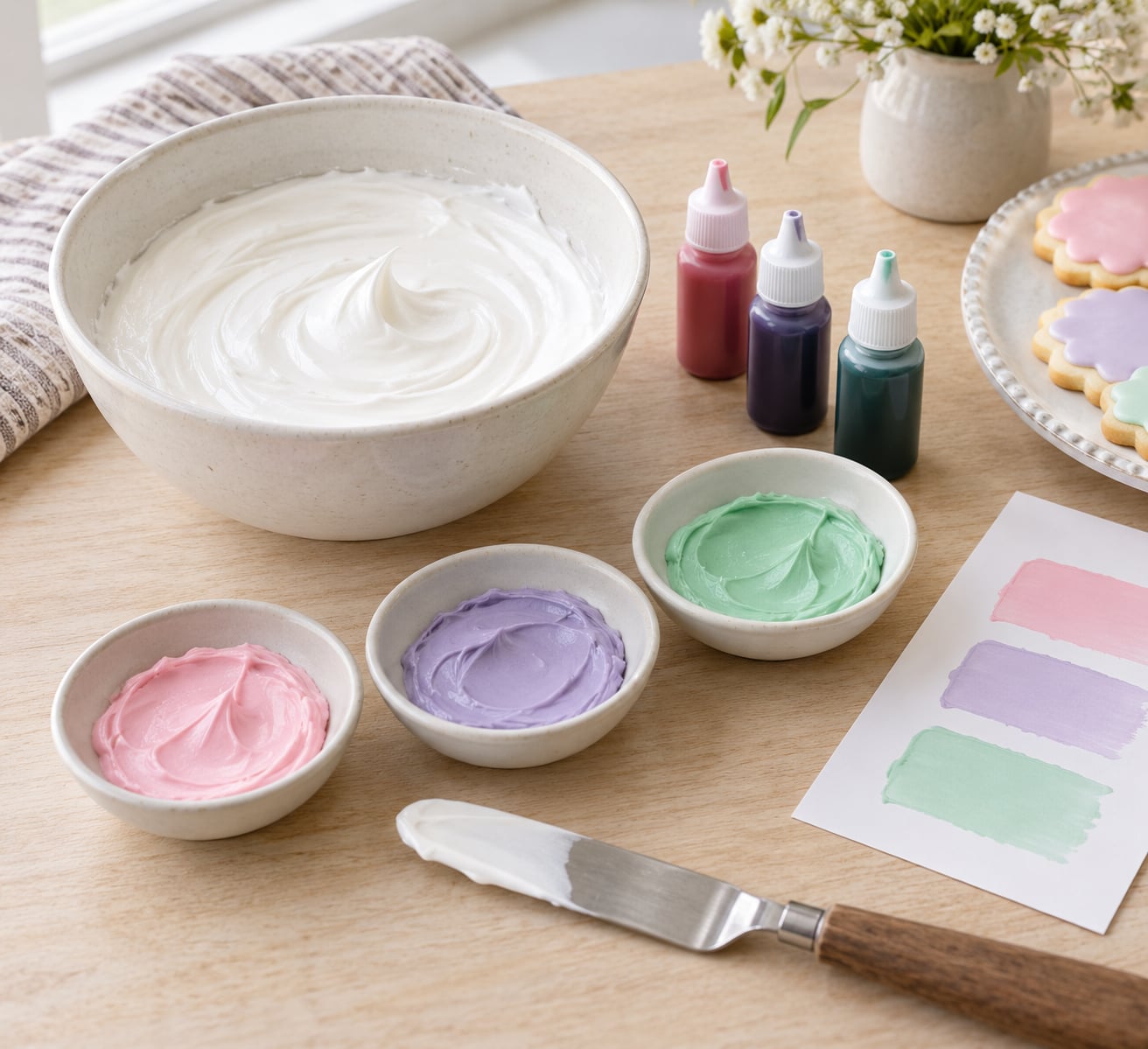
To make icing colors match a party theme, pull the theme’s dominant, secondary and accent colors, cut them down to three icing shades, then tint white frosting one drop at a time in separate reserved bowls, working from the lightest shade to the darkest.
Nearly all of that work happens before any color goes into the bowl. Fifteen minutes of swatching on a paper towel and a dot of scrap icing costs you nothing; a bad tint applied to a full batch of buttercream is a repurchase.
One thing to expect up front: two batches of icing will never match exactly, and that is normal. Butter color, humidity and how long the frosting has rested all shift the final shade a little. Aim for a color that reads as the same color beside your decorations, not a laboratory match.
A cake is usually the only edible thing left sitting on the table after the candles and paper plates are gone. Matching its icing to the theme colors is what makes the dessert look planned instead of picked up at the last minute.
Table of Contents
- What You Need
- Step-by-Step: How to Make Icing Colors Match a Party Theme
- Common Mistakes and How to Fix Them
- Tips for Matching Popular Party Themes
- Frequently Asked Questions
- What type of food coloring is best for matching party theme colors?
- How do I make icing the same shade as a party decoration?
- Can I change the color of icing after it has already been mixed?
- Why does my icing color look different after it dries?
- How many colors should I use on a themed cake or cupcake?
- Can I use natural food coloring to match a party theme?
- Conclusion
What You Need
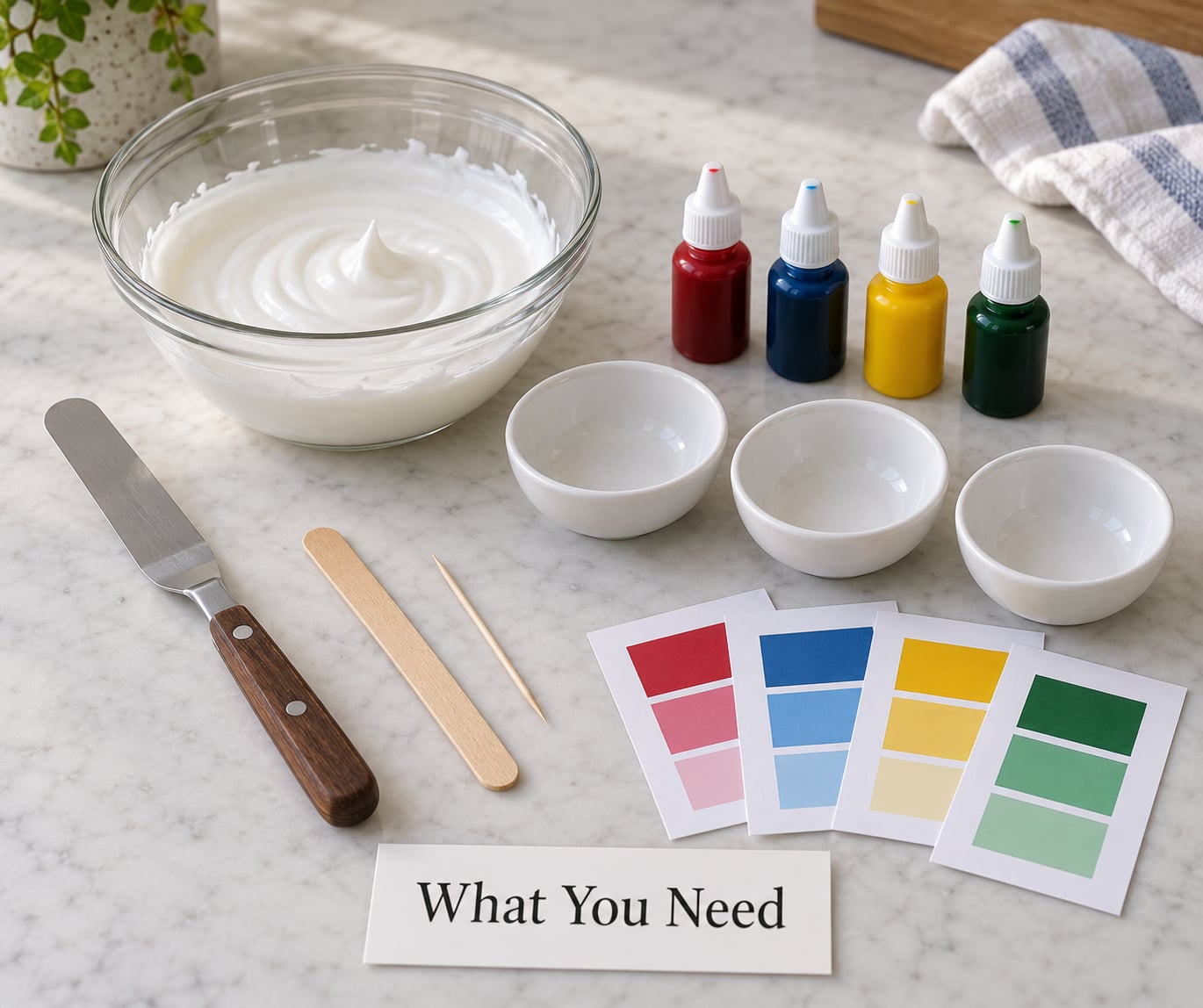
You need less than the cake shop supply list implies. Most of it is white icing you already planned to make, plus somewhere to reserve a test portion before the real tinting starts.
- White base icing. American buttercream, Swiss meringue buttercream, royal icing or ganache. Pure white matters, so skip butter that carries color.
- Gel food coloring in the core hues you need: red, yellow, blue, green, violet and black. Black is the workhorse for muting any color down.
- Two or three small bowls, roughly cereal-bowl size, for tinting test portions.
- A palette knife or sturdy wooden spoon for folding color in without beating air into the frosting.
- Toothpicks for single-drop additions. A toothpick holds far less than the tip of a dropper bottle.
- Paper towels or parchment for swatches.
- A printed or screen copy of your theme reference, ideally something with flat color blocks rather than a photo full of shadows.
If you have not made the base yet, our guide to buttercream frosting covers the batch sizes that leave enough spare icing for testing.
Step-by-Step: How to Make Icing Colors Match a Party Theme
Six steps, in this order. The order matters more than the technique, because mixing dark colors first is what contaminates the pale shades you need later.
1. Identify the Main and Accent Party Colors
Look at everything that will already be in the room before you touch a bowl. Invitations, balloons, tablecloth, napkins, flower arrangements, the birthday girl’s shirt if you are allowed to peek at what she is wearing.
Sort those colors into three jobs. The dominant color is the one that repeats most, usually on the largest surface. Secondary colors support it. Accent colors are small pops that appear on a napkin or a ribbon.
Then decide what actually goes on the cake. A cake that carries all six colors in equal measure looks busy, not coordinated. Most cakes photograph best with the dominant color as the main coat, the secondary color as borders or flowers, and one accent used sparingly on top.
2. Build a Small Icing Color Palette
Three colors is the sweet spot for a themed cake or cupcake, and the 60-30-10 rule from interior design maps onto icing cleanly: roughly 60 percent dominant color, 30 percent secondary, 10 percent accent.
Write the three names down before you mix anything, and add the specific gel colors each one needs. Pale mint needs blue plus a drop of yellow. Dusty rose needs red plus a trace of black or gray. Grey is not a color you can buy; it is a mixed color made by thinning black with white or by adding black to any other hue.
Choosing colors that sit next to each other on the wheel also helps. Analogous palettes, three neighbors such as blue, blue-violet and violet, always look intentional. Complementary pairs, opposites such as coral and teal, look striking but need a neutral somewhere to keep them from fighting.
3. Mix the Icing to the Right Shade
Start with white icing and add gel color slowly. Gel is concentrated, so a toothpick dipped once gives you roughly what a whole dropper gives you in liquid color. Add, fold, then add again.
Reserve a separate bowl of white icing purely for testing before you tint the batch you will actually pipe. Scoop a quarter cup at a time, tint it, and keep working from the reserve. Once you have the shade, mix the real batch to the same recipe.
| Target shade | Start with | Add | Starting drops per cup |
|---|---|---|---|
| Pale pink | White | Red gel | 1 to 2 |
| Peach | White | Red and yellow gel | 1 red, 2 yellow |
| Lavender | White | Red and blue gel | 2 red, 1 blue |
| Mint | White | Blue and a trace of yellow | 2 blue, 1 yellow |
| Dusty rose | White | Red and a trace of black | 2 red, 1 black |
| Sky blue | White | Blue gel | 2 to 3 |
| Deep navy | White | Blue gel | 10 to 12 |
| Butter yellow | White | Yellow gel | 3 to 5 |
| Teracotta | White | Red and orange gel | 3 red, 5 orange |
| Chocolate brown | White | Red, yellow and blue gel | 4 of each |
Those numbers are starting points, not targets. Every brand of gel sits at a different concentration, so write down what worked for you in your own notes. The second time you make the same shade for the matching cupcakes, you will hit it in one mix instead of four.
Two warnings here. Colored buttercream that gets over-beaten picks up air bubbles that telegraph themselves across a smooth finish, so fold gently with a spatula at low speed. And gel color added to cold frosting can seize, so let the butter come to room temperature before tinting.
4. Test the Color on the Actual Icing
A swatch on paper towel is a test of hue. It is not a test of how the color will read on cake, because icing is opaque, sits on a colored background, and picks up warm bounce light off the surface.
Put a small blob of your tinted frosting directly on the cake, cookie or cupcake you are decorating. Use a palette knife to smooth it flat and leave it for ten minutes. Set the rest of your swatches beside it and compare again.
If you are using royal icing or a flat glaze instead, test on a spare cookie rather than the cake. Those colors sit thinner and pick up whatever is underneath them.
5. Compare the Test Swatches with the Theme
Hold your icing swatch next to the physical theme reference, not a screen photo. Screens shift color depending on brightness and warmth, and a printed swatch is closer to what your guests will see in the room.
Check three things. Hue: is this the same family, or has it drifted toward a neighbor? Value: is it as light or as dark as the reference? Intensity: is it as saturated, or washed out?
Then step back about six feet and look again. That distance is roughly where the cake will be when people see it, and a shade that looks wrong up close often disappears at arm’s length, and the reverse happens too.
If the icing is too bright, add a drop of the color’s neighbor rather than white. Adding white lightens but also flattens, so a touch of violet in a pink, or grey in a red, keeps the depth.
6. Apply the Final Colors Cleanly
Thin layers beat thick ones. Apply a thin coat of your dominant color, chill until it firms, then add the next layer. You get a more even finish and the shade ends up closer to your swatch.
For piped work, fill separate bags and pipe a test stroke of each color onto a scrap cookie. You are checking flow and color, and you can re-tint the bag before it touches the cake.
Colors bleed when one shade is still wet under another. Let each piped section dry to the touch before you pipe the color beside it, or use a barrier: a thin line of stiff buttercream or royal icing between the two shades, then fill behind it.
When a theme only gives you two or three colors, ombré stretches them across the whole cake. Pipe the darkest shade on top, the lightest at the base, then run an offset spatula over the joins so the tones blend. One hue family in three depths reads far more designed than three unrelated colors.
Tuck leftover tinted icing into an airtight container, press plastic wrap onto the surface, and refrigerate it. Bring it back to room temperature and re-whip before reusing, or it will pipe as a stiff slab.
Common Mistakes and How to Fix Them
Almost every disappointing themed cake comes from one of eight predictable problems. Each has a straightforward cause and fix.
The color went muddy. You added complementary colors, or too many hues at once. Mud is what happens when you mix blue into brown to grey it. Fix it by starting again from white and adding a single hue plus one drop of black or grey, rather than blending two colors to a third.
The shade is too dark to fix. There is no way to lighten buttercream once it is dark except by diluting it. Fix it by mixing a second batch of white and folding the dark color into it a spoonful at a time until you reach the target.
The finish is blotchy. Usually a thick coat over a crumb coat that was too thin, or color applied to a warm cake. Fix it with thin layers over a set crumb coat, and refrigerate the cake for ten minutes before you start piping.
The color shifted after it set. Colors intensify as they stand, especially in buttercream, because the butter solidifies and traps the pigment. If you matched the swatch and the cake reads darker hours later, tint lighter than your reference next time. The gap is usually a few drops, not a hue change.
Air bubbles show through the finish. The frosting was over-mixed after the color went in. Fix it by adding a tablespoon or two of cold butter and mixing briefly on low, which knocks the bubbles down and firms the frosting at the same time.
Colors bled into each other. One shade was still wet. Fix it by drying each section before the next, or piping a stiff buttercream barrier line between colors and filling behind it.
There are too many colors on the cake. Every shade matched something in the room, and together they cancel out. Fix it by cutting the palette to three and letting the decorations carry the rest of the theme.
The matching cupcakes never match the cake. The two batches were tinted at different times and at different room temperatures. Keep a written recipe of drops per cup, weigh the icing as you scoop it, and mix the second batch the same day so both see the same temperature.
Tips for Matching Popular Party Themes
Every theme below reduces to a dominant, secondary and accent. These shortcuts tell you which gel colors reach the shade fastest.
Floral. A buttercream base in soft sage, borders in dusty rose, and a few petals in muted peach. Add a trace of black to the rose or it reads as bubblegum pink.
Minimalist. One color, done well: a matte white coat with a single deep shade, usually navy or forest green, in thin clean lines. The match is about restraint, so skip the third color entirely.
Pastel. Any two or three pale shades plus white. Pastels need fewer drops than people expect, so start at one drop and check every ten minutes. Save an accent like gold leaf or sprinkles for the contrast.
Tropical. Turquoise, coral and a mango yellow. This palette works because turquoise and coral are opposites and the yellow warms the pair. Keep the third color on a border or flowers, not the main coat.
Holiday. Christmas leans red and deep green with white; Halloween runs black with orange and a plum. Dark colors hide small mistakes, so tint them a shade lighter than the reference and let them set.
Woodland. Muted olive and terracotta with cream. Both need a drop of black or grey to leave the cartoon-bright range. Finish with gold leaf if you want a metallised accent rather than a flat one.
Nautical. Navy, crisp white and one coral stripe. Navy takes roughly ten drops per cup, which is far more than most people expect, so mix a small batch first.
Character-inspired. Pull one color straight from the character’s costume or from their party plates, then pull a second from a background element. Silhouettes and faces are where a mismatched shade shows most, so paint those in the simplest dominant color.
Whatever the theme, reduce it before you mix it. Three coordinated shades on one cake read as a design. Seven matching shades read as a shopping list.
Frequently Asked Questions
What type of food coloring is best for matching party theme colors?
Gel food coloring gives the most control for theme matching. It is concentrated, so a toothpick dipped once moves the shade a small, repeatable amount, which matters when you are chasing a specific reference color. Liquid coloring is thinner and needs several drops for the same result, and it can thin stiff royal icing enough to make it bleed. Powdered coloring is useful on dry surfaces like royal icing transfers or stencil work, but it clumps if mixed directly into buttercream.
How do I make icing the same shade as a party decoration?
Tint white frosting in a small test bowl first, then test a blob of it directly on the cookie or cupcake you plan to decorate. Compare it against the physical decoration rather than a phone photo, since screens shift color. Check hue, value and intensity, then view it from about six feet away. If it is too saturated, add a drop of the neighboring hue rather than white, which keeps the shade deep instead of chalky.
Can I change the color of icing after it has already been mixed?
Only upward in depth, never back to pale. Once a batch is tinted dark, the only fix is to mix a second batch of white and fold the dark color into it a spoonful at a time until it reaches the shade you wanted. That is also why the standard advice is to tint from the lightest shade to the darkest, working out of a reserved bowl of white icing so a dark test never contaminates the pale batch.
Why does my icing color look different after it dries?
Two reasons. Buttercream deepens as it rests, because the butter firms and holds the pigment more tightly, so a swatch that matches on paper towel will read a shade darker on the finished cake. Icing is also opaque and picks up warm bounce light from the surface beneath it, which warms the color. Both are why bakers tint slightly lighter than the reference and check again once the cake has set for an hour.
How many colors should I use on a themed cake or cupcake?
Three works for almost every themed cake or cupcake, following the 60-30-10 ratio: the dominant color covers most of the surface, the secondary handles borders or flowers, and the accent appears in one small detail. American buttercream, royal icing and ganache all take color well. Whipped cream and cream cheese frosting hold their own tint but stay soft, so they are better used on cupcakes than on a cake that has to sit out for hours.
Can I use natural food coloring to match a party theme?
Yes, with one trade-off. Natural colorings made from beet, berry or turmeric concentrate deliver the same palette, but their shades are often less saturated and can shift in tone, particularly in a bright room. Beat a small test batch first and check it after an hour. If the theme depends on an exact match, a deep jewel tone such as navy or emerald is far easier to hit naturally than a bright coral or fuchsia.
Conclusion
Pick the theme’s dominant color first, mix one small test batch to a shade slightly lighter than your reference, and lay it on a spare cookie or cupcake to compare. Once that one shade is right, the rest of the palette follows from the same reserved bowl of white icing.